What is it?
Data Visualization software gives the user the ability to processes information and present data which can be represented visually through formats either pictorially or graphically. Each software offers a range from simple charts and graphs to complex flow charts and geographical maps. The essential objective is to create a visual representation of patterns, trends and outlines that can be engaged, understood and shared with audiences more effectively and efficiently. Many of these visualizations are interactive, allowing users to adjust settings and see the impact in real-time. When more and more data is collected and analyzed the use of data visualization software helps to enhance analytical results to differentiate between numerous variables, communicate concepts, predict trends past, present and even future.
How does it work?
How can one make data powerful? How do we illustrate the meaning, how do you explain a story, how do we share a story? What classifies good data visualization? Let’s take for example, a number set, 8434287493492248084. How many 8’s are there? Okay, try again 8434287493492248084. See how a simple color change makes comprehension instant. Color is one of several pre-attentive attributes. Like size, orientation or flicker, these are visual clues that enable the human brain to process within 250 milliseconds. Imagine our objective is not to look for a specific number, but a pattern, we can use color to show correlation, size to show quantity or orientation to show trends. The power of data visualization can also be used to better communicate all sorts of information: processes, hierarchy, anatomy and chronology.
See Software Comparison
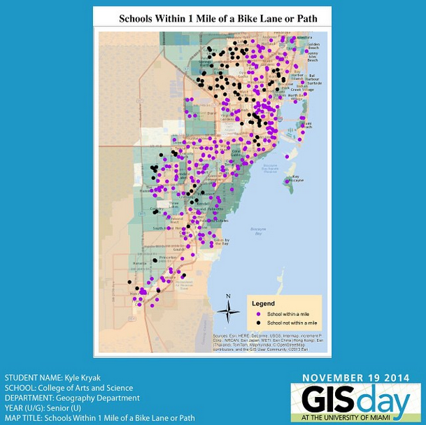
GIS Day at The University of Miami – School of Arts and Sciences
Who’s doing it?
University of Miami
Places and Spaces will Change the World
Data Visualizations ‘Worth a Million Words’ Unveiled at UM
Researchers to Create World Database at CCS for Nervous System Repair
GIS Resources at UM Libraries
The School of Communication, MFA track in visualization/data
Research – Universities & specific software use
ArcGIS
GIS flourishes at Stanford University – Stanford University
New Tool for CSI? Geographic Software Maps Distinctive Features inside Bones – The Ohio State University
Highcharts
Visuals Aloft: Interactive Graphs with Highcharts – Columbia University
Multivariate Accommodation Calculator – Penn State
Qlikview
Program Costing model, Video – University of East London
Professor Luo and his experience with Qlikview – Villanova School of Business
Qlikview Tips – UPENN
SAS
Forecasting Enrollment in Higher Education Kennesaw State University
SAS signs researching partnership – NC State
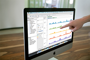
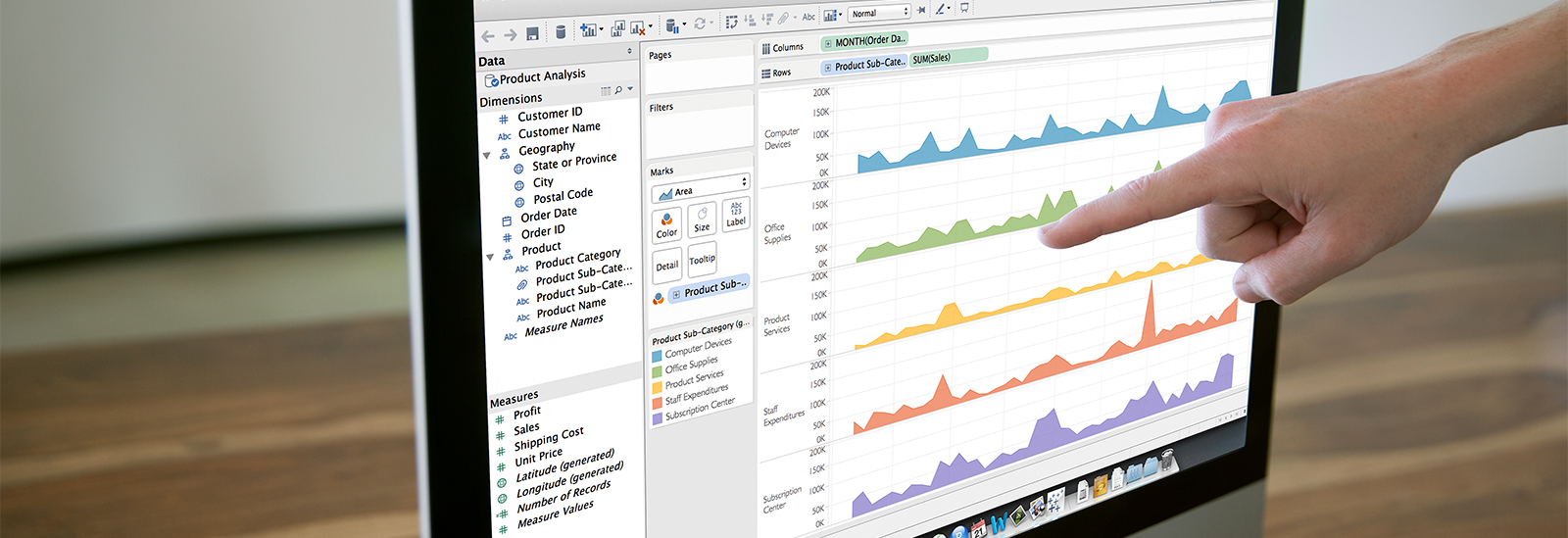
Tableau
Visualizing Data using Tableau – Washington University
UC Irvine Medical Center – Tableau – UC Irvine
Factbook, Survey Data and Diversity Dashboards – Cornell University
Why is it significant?
A picture is worth a thousands words. Data visualization software enables the user to spot emerging patterns in vast quantities of multi variant data. Traditional tools force users to rely on IT for each section of data and/or are limited by the amount of data which can be handled. Having the ability to explore and share vast amounts of data (big data) on a desktop or mobile device in a dimension free, easy to use application is the key to insight. The goal is to maximize an audience’s retention of relevant information, by providing beyond a passive but more active learning environment.
What are the downsides?
Understanding the data in the right shape for its intended benefit is sometimes problematic. The user must know the context and understand what it is that they are trying to visualize and convey from each data set. Additionally, the tool will only prove valuable if the quality of data is assured. If we are to use the data to make an informed decision that impacts a large audience, the process must be verifiable and reflect the most current of data collection. If not done correctly, that visualization data set will prove to not be valid.
The use of specialized software may have a learning curve, thus training/coursework may be required. Leveraging training tools such as Lynda.com can overcome this.
Where is it going?
The University of Miami just launched a graduate degree of a MFA in Interactive Media with a specialization in Data Journalism and Visualization. The track is a product of a collaboration between the departments of Cinema and Interactive Media, Journalism and Media Management, and Geography. It has a strong focus on visualization and infographics design, technology, visual journalism and storytelling, mapping, and also on analysis and research.
The future of Business Intelligence is Data Visualization. The amount of emerging Data Visualization startups is growing exponentially and most of them are beginning to lead the market (see state of Data Visualization ). This growth allows for competitive pricing and the creation of additional features and/or improvements. With the increasing compatibility of HTML5 and Javascript web applications, websites displaying interactive data charts and maps is becoming the norm. Allowing visitors to visualize and interact with historical higher education enrollment data on a University website for example, simply stands out from the rest. What does your data look like?
What are the implications for teaching and learning?
Visualization can turn complex problems into simple ones, make patterns obvious and even impossible to miss, can be observed faster than your eyes can move, and accommodate diverse learning styles. Essentially, visualization makes users more productive. For example, dynamic and interactive visualizations can be embedded in online course materials to provide up-to-date data, thus reshaping the traditional content to accommodate both visual and aural learners, something that has not been effortlessly accomplished when utilizing traditional textbooks or excel spreadsheets. Data visualization opens itself up for multiple ways of representing data graphically. This allows for a single data set to be visualized in unique ways by either individuals or teams.
For students, data visualization can be used to describe a phenomenon (occurrence, process, action, and concept) where students present a collection of information ( numbers, formulas, words) from there the depiction of data can be visualized and processed to gain deeper understanding. Students using specialized software such as Tableau, are enticed to learn or apply unfamiliar skills, such as data integration, while at the same time obtaining the inspiration necessary to transform mundane data into appealing visual representations suitable for in class presentations, group projects, and informational displays.